TotalSnap will now detect if a user is viewing the site on a mobile device and automatically produce a mobile friendly version.
A standard website, when viewed on a mobile phone, will either get shrunk down to fit on the page, or end up with giant awkward scroll bars everywhere. A TotalSnap site will automatically serve up a mobile friendly version complete with scaled images and content.

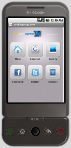
A mobile friendly home page with links to each section of the website.

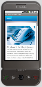
Images and content automatically reformatted to fit a mobile screen.

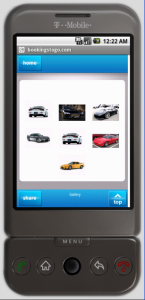
An alternate photo gallery reformatted for a mobile screen complete with photo zoom.
TotalSnap will show a nifty interface for users to access the main conent, the contact page, the location map, the image gallery, and the social networking links. Each of these pages are designed to show nicely on a mobile device.
This all happens with no configuration, extra work or any effort at all!
 CA
CA US
US


